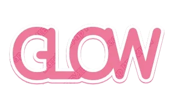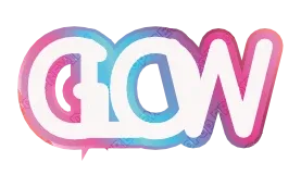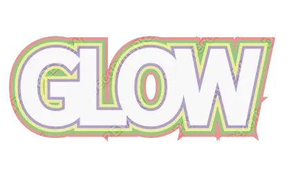
The short answer
Type your word into the Outline Text Generator, pick a style whose outer outline is white, and download:
- Transparent PNG — the white edge stays around the letters with nothing behind it, ready for a photo, a video or a post.
- SVG — each outline is its own shape, so it stays sharp at any size.
- Cut file — for a Cricut or Silhouette, with the outlines turned into solid shapes and the colors split into layers (tap Customize more to open the style in the editor, then export the SVG as a cut file).
No sign-up, free while in beta, and it works in the browser on a phone.
Why “just add a stroke” looks wrong
Most editors give you a stroke: a line of a set width drawn on the edge of each letter. For a thin outline that is fine. For a thick sticker edge it goes wrong in three ways:
- Half of the stroke eats the letter. A stroke is centered on the edge, so a 10 px stroke covers 5 px of the letter itself. Thin letters get thinner.
- Sharp corners turn into spikes. Where a letter has a pointed corner — the tip of a
V, the top of anA— a thick stroke shoots out a long point. - Letters keep their own borders. Each letter gets its own outline, so where letters sit close together you see a seam instead of one smooth sticker shape.
A sticker edge is not a line. It is a bigger shape behind the word, grown evenly outward from every letter and merged into one piece.
What a good sticker edge looks like
- Even thickness all the way around, including inside curves.
- Clean outside corners, without long spikes shooting out of sharp letter tips.
- One merged shape behind the whole word, so the letters sit on a single white island.
- Holes stay open — the inside of
O,AandB— unless the border is so thick it fills them on purpose.
The outline styles here work that way: each outline is worked out from the shape of your letters rather than drawn as a line on each one, so a word with several stacked outlines keeps even layers.
Two outlines or six?
| Look | Outlines | Good for |
|---|---|---|
| Clean label | 1 dark | Text on a plain background |
| Sticker | 1 dark + 1 white | Text on photos, die-cut stickers |
| Party / retro | 3–6 colors | Signs, shirts, thumbnails |
| Premium | 1 thin gold or silver | Logos, invitations |
A dark outline next to the letters, then the white edge outside it, is the most readable combination on a busy photo.
Tips for borders that read well
- Contrast neighbors. Light next to dark. Two similar colors side by side blur into one band.
- Make the outer border the thickest when the text sits on a photo.
- Watch the holes. If
eandafill in, use thinner borders or a font with bigger openings. - Fewer layers for long words. Many thick borders on many letters start to merge into a blob.
For printed stickers and vinyl
- Printed stickers: download the PDF. It comes in print colors with bleed and crop marks, which most sticker printers ask for. The white border becomes part of the sticker shape.
- Vinyl and iron-on: export a cut file from the editor. The colors are split into layers, so you can cut the white edge from white vinyl and the letters from another color, then stack them — biggest layer first. See HTV layering order and layered vinyl text.
Try it
Open the Outline Text Generator, type your word, and pick a white-edged style. For puffy, rounded letters with the same edge, try the Bubble Letter Generator.