The short answer
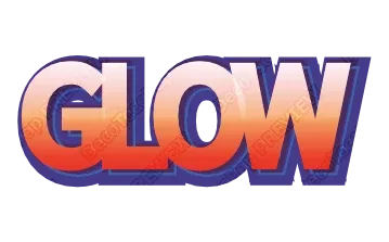
Use three words or fewer, a heavy font, one strong outline, and high contrast between the letters and the outline. Make the text in a 3D Text Generator or Game Logo Text Generator, download a transparent PNG, and drop it onto your thumbnail. No sign-up, free while in beta.
YouTube recommends thumbnails at 1280 × 720 (16:9). But that is the file size, not the size people see: in a phone feed a thumbnail is often only a few centimeters wide. Design for that.
1. Three words or fewer
A thumbnail is read in a glance. One to three short words in big letters beat a full sentence in small ones. Put the rest of the title in the video title, where it belongs.
2. Pick the heaviest font you can
Thin strokes vanish when shrunk. Use a bold or black weight. Effects like 3D sides and thick outlines eat into thin letters even more.
3. One strong outline beats many thin ones
A single thick dark outline around light letters (or the reverse) separates the text from a busy screenshot. Many thin outlines look great large and turn into mud small.
4. Contrast the fill and the outline, not just the colors
Yellow letters with a black outline work on almost anything. Two saturated colors next to each other — red on blue — vibrate and blur. Check your text in grayscale: if the letters and the outline become the same gray, the contrast is too low.
5. 3D and shine help, a little
A short 3D side or a highlight on top makes the text look like an object and helps it stand out from the photo behind it. Keep the depth moderate; long sides on many letters make the word wider and harder to read.
6. Leave the bottom-right corner alone
The video length badge sits in the bottom-right corner of the thumbnail. Don’t put a word there.
7. Test it small
Shrink the finished thumbnail to about 160 px wide. If you can still read the words at a glance, you are done. If not, cut a word, thicken the outline or raise the contrast.
Styles that work well at thumbnail size
- Comic 3D — bold outlines shifted to one side, like a cartoon cover. Readable on any background.
- Chrome or gold on a dark outline — strong contrast, looks premium.
- Glossy 3D — bright colors with a highlight, good for gaming and kids’ channels.
- Grunge — for horror and survival, but keep the font extra heavy; rough edges lose detail small.
Browse them with your own title in the Game Logo Text Generator, the 3D Text Generator or the Graffiti Text Generator.
Getting the text onto the thumbnail
- Type your words and pick a style.
- Download a transparent PNG — everything around the letters is see-through.
- Place it on your thumbnail in any editor. Export the PNG at least as large as the text will appear on the 1280 × 720 image, so it doesn’t blur.
The downloaded file keeps its editing data, so you can open it again later and change the words for the next video.