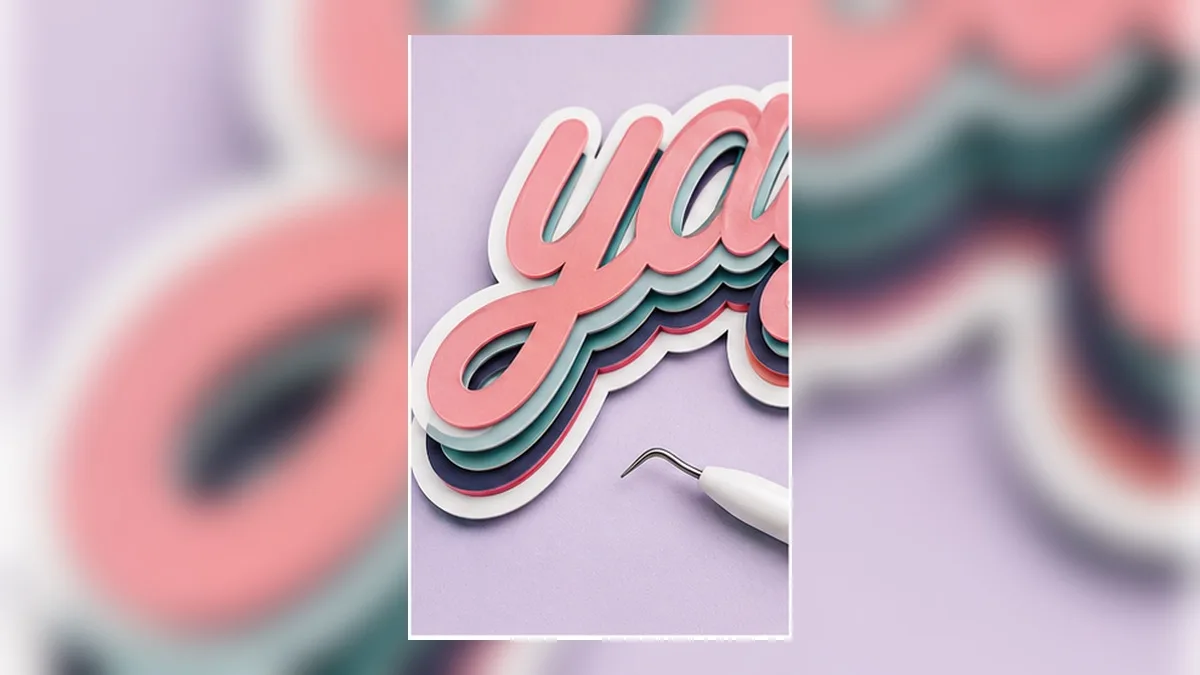
You’re being sold the word, not the technique
Search for layered text and you’ll find hundreds of listings: a beautiful three-colour outline design that says “Mama” or “Blessed” or “Game Day.” They’re well made and they’re cheap.
They also say what they say. Want it to read your daughter’s name, or your shop’s, or the phrase from an inside joke? Buy another one — if it exists.
The layering itself isn’t hard. It’s a stack of the same shape at increasing sizes, and once you can generate that from your own text, the entire category of purchase becomes optional.
What a layered design actually is
Take one word. Now make four copies of its outline, each slightly bigger than the last, in different colours, stacked back to front.
| Layer | What it is | Cut from |
|---|---|---|
| 4 (front) | The letters themselves | Colour A |
| 3 | The letters, grown ~2 mm | Colour B |
| 2 | The letters, grown ~4 mm | Colour C |
| 1 (back) | The letters, grown ~6 mm | Colour D |
That’s the whole trick. Each layer is the same shape “grown” outward — an offset — and the growth amount is the visible band width.
Two consequences worth internalising:
- Every layer must be the same shape. If layer 2 is a slightly different word or spacing, nothing lines up.
- Only the front layer has detail. The back layers are progressively simpler blobs, because growing a shape rounds off its fine features.
The manual way, and why it gets old
In most cut-machine software you build this by hand:
- Type the text
- Merge overlapping letters
- Duplicate it
- Apply an offset of 2 mm
- Change the colour, send it backwards
- Repeat steps 3–5 for every layer
- Select everything and align it
That’s roughly a dozen operations for four layers. It works. The problem is step 0: change the word and you do it all again. Which is exactly why layered designs are sold as finished files with fixed words.
Building the stack from your own text
The alternative is to have the stack generated from the text, so the layers stay linked to the words.
- Type the phrase.
- Set the font and spacing. Do this now — changing it later changes every layer.
- Add outline layers, choosing a width and colour for each. Two to four is the usual range.
- Check the widths at finished size. A 2 mm band on a 3-inch decal reads well; on a 1-inch decal it swallows the letters.
- Export. For cutting, one file per colour, or one file with the colours separated into groups.
Because the layers are generated rather than duplicated, retyping the word regenerates the whole stack — same widths, same colours, still aligned. That’s the difference between a technique you own and a file you bought.
The same non-destructive idea applied to heavy decoration: Retype even the most heavily styled text.
Choosing widths that read well
Band widths are the whole aesthetic. Some starting points:
- Even bands (2 mm / 2 mm / 2 mm) look formal and calm
- Increasing bands (1 mm / 2 mm / 4 mm) look chunky and casual
- One thin accent (0.5 mm) between two thick layers reads as a highlight
- Below about 1 mm, the band will be fragile in vinyl and hard to weed
And a size rule: the widest total growth should stay under roughly a third of the letter height, or the letters disappear inside their own outlines.
Registration: keeping the layers aligned
This is where layered projects fail in practice, and it’s mostly solved before you cut.
Cut every layer from one aligned design. If the layers were generated together, they share a coordinate space and line up by construction. Never reposition a layer after generating it.
Keep the carrier or backing generous. Don’t trim tight. Extra material gives you edges to align against and lets you see through to the layer below.
Overlap deliberately. The upper layer sits on top of the lower one — so the lower one should extend under it by the full band width, not butt up against it. This is why offsets are the right tool: they grow the whole shape rather than creating a ring.
Build from the back. Lay the largest layer first, then work forward. Each new layer covers the alignment errors of the one before it.
For heat-transfer specifically, including press times between layers, see HTV Layering: Which Colors Go First?
Colour combinations that hold up
Layered lettering lives or dies on contrast between adjacent bands.
- High contrast between neighbours. Two similar mid-tones next to each other read as one muddy band
- Darkest at the back is the safest default — it reads as a shadow
- White as the second layer is the classic sticker/decal look and separates the design from any background
- Metallic or glitter on the back layer only. It catches light without competing with the lettering
- Three colours is usually the sweet spot. Four is achievable; five is stiff on fabric and fiddly to weed
Fonts that layer well
Offsets grow every part of a letter, including the inside of counters — the hole in an o shrinks as the outline grows.
That means:
- Open, generous counters survive layering; tight ones fill in
- Heavy weights layer better than light ones, because the letters still read after being surrounded
- Very ornate scripts lose their flourishes by layer 2 or 3 — the offset rounds them away
- Check the counters at the widest layer, not the front layer. That’s where they close up
More on picking a font that survives being cut: Best Fonts for Vinyl Decals.
A worked example with real numbers
The job: a three-colour layered name decal, 6 inches wide, for a car window.
1. Size and letter height. Six inches wide, five letters, in a heavy script — that’s roughly 1.6 inches of cap height. Comfortable.
2. Band widths. The rule of thumb says total growth under a third of letter height: 1.6 / 3 ≈ 0.53 in. So the outer edge of the last layer can sit up to about half an inch outside the letters. Using 2 mm + 3 mm gives 5 mm total (0.20 in) — well within budget, and visually balanced.
| Layer | Growth | Colour | Cut size |
|---|---|---|---|
| 3 (front) | 0 | White | 6.00 in wide |
| 2 | 2 mm | Black | 6.16 in wide |
| 1 (back) | 5 mm | Red | 6.39 in wide |
3. Check the counters at the widest layer. The back layer’s counters have shrunk by 5 mm on every side — 10 mm total across each hole. If a counter was 8 mm across in the original, it has now closed completely. That’s fine (the back layer is a silhouette), but check it isn’t creating a shape you didn’t intend.
4. Check the thinnest stroke on the front layer. The front layer is the original letters, so this is where thin strokes bite. At 1.6 in cap height a signage script is comfortably above 1 mm.
5. Cut each colour, weed, stack.
Notice that layers 1 and 2 are physically larger than the front layer — so plan your material. A 6-inch design needs a 6.5-inch piece of the back colour.
Weeding a layered design efficiently
Layered projects multiply weeding time, so order matters.
Weed the front layer last. It has the most detail and is the most fragile. Weeding it while the other layers sit around waiting is how it gets damaged.
Back layers are fast. A grown silhouette has few internal details — often just the outer edge and one or two remaining counters. These weed in seconds.
Use a weeding box per layer. Cut a rectangle around each so waste comes off in one piece.
Label the layers as you go. Three pieces of clear-backed vinyl look identical five minutes later. A sticky note on each is not overkill.
Check counters before you stack. A counter you forgot to weed on layer 2 is invisible until it shows through the finished piece.
Transfer tape technique for multi-layer
There are two ways to assemble a stack, and they suit different jobs.
Method A — stack on the transfer tape (best for small, precise designs).
- Lay the back layer on transfer tape
- Position layer 2 on top of it, aligning by eye through the tape
- Position the front layer
- Apply the whole stack to the surface in one go
Advantage: you can correct alignment before anything touches the final surface. Limitation: gets unwieldy above about 8 inches.
Method B — apply layer by layer (best for large designs).
- Apply the back layer to the surface
- Apply layer 2 over it, aligning against the layer below
- Apply the front layer
Advantage: each layer is easy to handle. Limitation: an error on layer 1 is permanent by the time you notice it on layer 3.
For either method: use a hinge. Tape the top edge of the transfer sheet down, lift, position, lower. It converts an all-or-nothing placement into something adjustable.
When to fake it instead
Layered cut vinyl is not always the right answer.
Print it instead if: the design has more than four colours, includes gradients, or is going on something that will be washed frequently. A printed-then-cut sticker gives you unlimited colours in one piece.
Use a single layer with a printed look if: the piece is small. Below about 2 inches, layered bands become too thin to weed and too thin to align.
Use layered vinyl when: you want the physical depth — the slight ridge where layers meet is genuinely visible and is what makes the style look expensive. That texture is the one thing printing cannot reproduce.
Knowing which of the three you’re doing before you start saves the most time of anything in this article.
Frequently asked questions
Q. Can I make layered text on my phone?
Yes — in a browser. Generating the stack is a design job, not a machine job, so it doesn’t depend on what the mobile machine app supports. See Can You Use a Cutting Machine Without a Computer?
Q. How many layers before it gets impractical?
Three is comfortable, four is the usual ceiling for vinyl. Beyond that, weeding time and material thickness both climb fast.
Q. Do the layers need to be different colours?
No. Same-colour layers on different finishes — matte behind gloss, or vinyl behind glitter — is a subtle, expensive-looking effect.
Q. My back layer lost all its detail.
That’s what offsetting does: growing a shape rounds off fine features. It’s expected, and usually desirable — the back layer is a silhouette, not a copy.
Q. Can I sell what I make with this?
The technique is yours. What matters is the font licence — check that it permits commercial use. See Making Stickers to Sell.
Summary
- A layered design is one shape, grown outward several times — nothing more
- Building it by hand is a dozen operations, and retyping means starting over
- Generate the stack from the text and the word stays editable
- Keep high contrast between neighbouring bands, darkest at the back
- Alignment is solved in the file, not on the mat — never move a layer after generating it
Buying a layered SVG gets you one word. Learning the stack gets you every word.
→ Generate layered outline text from your own words (no sign-up · export free for a limited time)
Cricut, Design Space and Silhouette are trademarks of their respective owners. DecoTecoPop is an independent tool and is not affiliated with, endorsed by, or sponsored by any cutting-machine manufacturer.