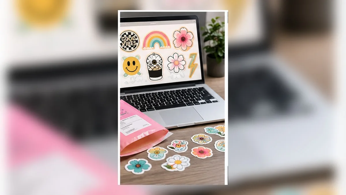
Buyers can tell, and it’s usually the file
Two shops sell the same style of sticker. One looks like a small brand; the other looks like a school project. The designs are often equally good. The difference is almost always in the file: resolution, edges, colour, and layout.
None of it is difficult. It’s just a list of things nobody tells you until a customer messages about a fuzzy edge.
1. Resolution: the number that decides everything
Print wants roughly 300 pixels per inch of finished size.
| Sticker size | Minimum pixels |
|---|---|
| 2 in | 600 × 600 |
| 3 in | 900 × 900 |
| 4 in | 1200 × 1200 |
| 5.5 × 8.5 in sheet | 1650 × 2550 |
Two rules that follow:
- You can go down, never up. Design at or above the size you’ll sell at. Enlarging afterwards invents detail that was never captured.
- Phone screenshots are not artwork. A screenshot is roughly 72–160 ppi. It will look soft the moment it’s printed.
If the design is lettering or flat shapes, build it as vector and this problem disappears entirely — vector has no resolution to run out of.
The full explanation is in Blurry Prints from Your Phone? Vector vs. Raster Explained.
2. Bleed and the white halo
The single most recognisable amateur tell is a thin white line around a die-cut sticker. It means the artwork stopped exactly where the blade landed.
Extend the colour 0.5–1 mm past the cut line. It gets trimmed away and nobody ever sees it — that’s the point.
Covered properly in Stickers With White Edges? Bleed, Offset and the Cut Line Explained.
3. Colour that survives the printer
Screens make colour from light; printers make it from ink. Neon pink, electric cyan and vivid yellow-green have no ink equivalent and will arrive noticeably duller.
This isn’t a settings problem you can fix at the end. It’s a choice you make at the start:
- If a colour is central to the brand, test-print it early
- Expect neons to shift; design so the piece still works when they do
- Rich blacks (black with a little cyan under it) print deeper than plain black on large areas
- Very light tints can band or disappear — check anything under about 5% coverage
Background reading: What is CMYK?
4. Sheet layout that doesn’t waste stock
If you’re selling sheets, layout is margin.
- Leave a quiet margin around the sheet — most printers need clear space to read registration marks
- Space stickers by at least 1/8 in (3 mm) so bleed from one doesn’t touch the next
- Mix sizes deliberately. A sheet of identical circles reads as filler; a considered mix of one hero piece and several small ones reads as designed
- Keep a consistent style across the sheet. Buyers are purchasing a set, not a folder of unrelated images
- Kiss-cut (through the vinyl, not the backing) if you want a peelable sheet; die-cut for individual stickers
5. Texture and finish as differentiation
Once the basics are right, finish is what makes a listing look premium: holographic, glitter, gloss, matte, clear.
Two things to know before committing stock:
- Holographic and glitter stock reads brighter than your proof. Designs with fine dark detail can get lost.
- Matte photographs better. If your listing photos matter — and they do — matte is easier to shoot without glare.
A cheaper route to the same “premium” impression: build the shine into the artwork. Gradients, gloss highlights and metallic-looking shading print on ordinary stock and cost nothing extra per unit.
See Like chocolate? “Melted and glossy” text, made on your phone for how that looks in practice.
6. Listing photos are part of the file setup
The best-prepared sticker still sells badly with a bad photo.
- Shoot on a plain, neutral background in daylight
- Include a scale reference — a coin, a hand, a laptop corner
- Show at least one sticker applied to something
- Keep the same background across the shop so the grid looks coherent
- If you use a mockup, make sure it shows the actual proportions
7. The licence questions that matter once money changes hands
This is the part that gets skipped and then becomes expensive.
Fonts. Every font has a licence. Many free fonts permit personal use only. Selling a sticker made with a personal-use-only font is a licence breach, regardless of how much you changed it. Look for fonts explicitly licensed for commercial use, and keep a record of where each came from.
Clip art and graphics. “Free to download” is not “free to sell.” Check whether the licence covers commercial use, and whether it requires attribution.
Characters, logos and brands. Fan art of a copyrighted character, a sports team logo, a brand’s wordmark — these are not yours to sell, no matter how they were drawn. This is the single most common reason a shop gets taken down.
AI-generated artwork. Rules differ by platform and jurisdiction and are changing. If you use it, check the terms of both the generator and the marketplace, and be prepared to disclose it.
Your own work. Keep the editable source files. If a design sells, you’ll want to make variants, and re-creating from a flattened PNG is miserable.
A pre-flight checklist
Before any design goes on sale:
- At least 300 ppi at the finished size (or vector)
- 0.5–1 mm bleed past the cut line
- Cut line separate from the visible border
- Colours checked for neon shift; one physical test print done
- At least 1/8 in between stickers on a sheet
- Clear margin for registration marks
- Font licence permits commercial use — and you can prove it
- No third-party characters, logos or trademarks
- Editable source file saved
- Listing photo with a scale reference
Knowing your cost per sticker
You can’t price sensibly without this, and most people guess.
Work it out per sheet, then divide:
| Line | How to get it |
|---|---|
| Sticker stock | Price per sheet |
| Ink | Cartridge cost ÷ pages it actually yields (not the claimed yield) |
| Laminate, if used | Price per sheet |
| Cutting mat wear | Mat price ÷ sheets before it stops gripping |
| Blade wear | Blade price ÷ sheets before quality drops |
| Packaging | Backing board + sleeve + mailer, per order |
| Waste | Add 10–15% for misprints and test cuts |
Divide the sheet total by the number of stickers on it and you have a unit cost. Two things usually surprise people: ink is a bigger share than the paper, and waste is real — a 10% allowance is optimistic when you’re dialling in a new design.
Then remember the costs that aren’t in the sheet at all: marketplace listing and transaction fees, payment processing, and your time. A common approach is to price at a multiple of unit cost and check that the multiple still leaves something after fees.
Packaging that arrives flat and undamaged
Stickers are cheap to ship and easy to ruin in transit.
- A rigid backing board behind the sheet stops bending. Cheap chipboard is fine.
- A clear sleeve keeps it clean and looks intentional when opened.
- A rigid or semi-rigid mailer for anything you don’t want creased.
- Don’t over-pack. Buyers notice excess packaging on a small item, and it eats the margin.
- A small thank-you card — or a free sticker — costs very little and drives a surprising share of repeat orders.
- Check the weight class. A few grams over a postage threshold can double the cost; weigh a finished package before setting shipping prices.
Listing photography, in more depth
Photos do more selling than the design does.
Light. Indirect daylight near a window, no direct sun. Overhead room lights create colour casts and glare on gloss stock.
Angle. Straight-on for the main photo — buyers want to see what they’re getting. Angled shots for secondary images, to show finish and thickness.
Glare. Gloss and holographic stock reflect. Turn the sheet, not the camera, until the reflection moves off the design.
Scale. At least one photo with something familiar in it. Sticker sizes are notoriously hard to judge, and “smaller than expected” is a common complaint that a scale photo prevents.
Consistency. Same background, same light, same crop across every listing. The shop grid is the first thing a buyer sees, and consistency reads as competence.
Show it applied. One photo of a sticker on a laptop, bottle or notebook does more than three studio shots.
Quality control before a batch goes out
Ten seconds per sheet catches nearly everything:
- Colours match the approved proof, not just each other
- No white edges anywhere on the sheet
- Kiss cut depth correct — peels cleanly, backing intact
- No ink smudges at the sheet edge from handling
- Laminate has no bubbles or dust trapped underneath
- Cut lines line up with the printed artwork on every sticker, not just the first
- The sheet is dry. Fresh inkjet prints can offset onto the sleeve
Pull anything doubtful. One bad sheet costs a review; a rejected sheet costs a few cents.
A word on scaling up
When a design starts selling, three things break in order:
- Your printer. Home inkjets are not built for volume. Cartridge cost per sheet climbs and print heads clog.
- Your time. Cut, weed, pack — at some volume the hourly rate stops making sense.
- Consistency. Batches printed weeks apart on different cartridges drift in colour.
The usual answer is professional printing for the winners and home printing for everything else. The file setup in this article doesn’t change — which is the point of getting it right early. A file that prints cleanly at home prints cleanly at a print shop.
Frequently asked questions
Q. What size should I sell stickers at?
2–3 inches covers most laptop and water-bottle use and is the most common range. Offer one larger hero size if the design supports it.
Q. PNG or SVG for a sticker?
PNG for the printed artwork (it carries colour and gradients); SVG if a separate cut path is needed. Print-then-cut workflows often use both.
Q. Do I need a professional printer?
No — a home printer plus sticker stock is where most shops start. The file setup is identical either way, which is why it’s worth getting right from day one.
Q. How do I stop my stickers looking homemade?
In order of impact: correct resolution, bleed, consistent sheet layout, and good photos. Design style matters less than people expect.
Q. Can I sell stickers made with any font?
No. Check the licence. Open licences that explicitly permit commercial use are the safe choice, and worth preferring from the start.
Summary
- 300 ppi at finished size, or vector — you can scale down, never up
- 0.5–1 mm bleed removes the white halo that marks a file as amateur
- Neon colours shift in print; test before committing stock
- Layout and consistency are what make a sheet read as a product
- Font and image licences are the risk that only appears once you’re selling
Get the file right once and it becomes the template for everything you sell afterwards.
→ Build print-ready lettering for your stickers (no sign-up · export free for a limited time)
This article is general information, not legal advice. Licence terms vary — always check the specific licence for any font or asset you use. Cricut, Design Space, Silhouette and Etsy are trademarks of their respective owners. DecoTecoPop is an independent tool and is not affiliated with, endorsed by, or sponsored by any of them.