Welding is the tool everyone reaches for, and the one that bites back
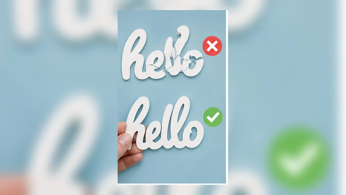
You picked a pretty script font, typed a name, and the letters overlap the way script letters do. If you cut it now you’ll get cut lines running through the middle of every join — the machine will happily slice each letter as a separate shape.
So you weld. And then one of these happens:
- The join looks lumpy, with a visible bulge where two letters met
- There are gaps — the letters didn’t quite touch, and now they’re separate islands that will fall apart in transfer tape
- The letter spacing collapsed or shifted
- You spot a typo, hit undo a few too many times, and discover the text is no longer text
That last one is the real problem. Welding is a one-way door, and every guide that shows you where the button is forgets to mention it.
What welding actually does
Think of each letter as a piece of paper. Overlapping letters are pieces of paper lying on top of each other. Welding takes the outline of the whole pile and throws away everything inside.
That’s it. It’s a shape operation, not a text operation.
Which means two things follow immediately:
- The result is no longer text. It has no font, no letters, no spacing. It’s one shape. You can’t retype it, and you can’t change the font.
- It only merges what physically overlaps. If two letters are 0.2 mm apart, welding does nothing to them — they stay two shapes that look joined on screen and behave as two pieces on the mat.
Most “bad weld” complaints are one of those two facts arriving late.
Why script fonts break it more than any other kind
Script and hand-lettered fonts are drawn assuming the letters flow into each other. But a font doesn’t know what word you’re typing — it just places each letter at a fixed advance width. So whether two letters actually overlap depends on which two letters they are.
lfollowed byomight overlap generouslyafollowed bytmight just barely touch- Anything followed by a capital usually leaves a visible gap
That’s why the same font welds beautifully on one name and falls apart on another. It isn’t the font’s fault and it isn’t yours — it’s that welding is a physical test and letter pairs fail it inconsistently.
Fixing it before you weld: close the gaps first
The reliable fix is to make the letters genuinely overlap before you merge anything.
1. Tighten the letter spacing. Pull the spacing negative until the letters visibly bite into each other. Not “touching” — overlapping. A hairline touch is what produces the islands that fall off in transfer tape.
2. Move individual letters. Break the text into separate letters and nudge the problem pairs. Tedious, but it’s the only way to fix one bad pair without wrecking the rest of the word.
3. Check at cut size, not screen size. Zoom to the actual finished size. A gap that’s invisible at screen zoom is very visible at 3 inches wide, and very fatal at 1 inch.
4. Then, and only then, merge.
Fixing it after: usually you can’t, and that’s the point
Once the text is a single shape, your options are limited to shape editing — pushing points around — and that’s a fiddly job on a phone and a slow one on a desktop.
The practical advice most people arrive at eventually: keep an unwelded copy. Duplicate the text, hide the original, weld the copy. When you find the typo, you still have something to go back to.
That works. It’s also a workaround for a tool that shouldn’t have made you choose.
The alternative: never weld at all
Welding exists because the design tool stores your lettering as separate letter shapes and only merges them when you ask. There is another way to build the same file: generate the outline of the whole phrase as one clean path from the start, while keeping the text itself editable underneath.
That sounds like a contradiction. It isn’t — it’s the difference between destroying the text and rendering it.
- The words stay words. Retype them, change the font, change the spacing.
- What gets exported is a single merged outline with no internal cut lines.
- Change your mind, export again. The merge happens at export time, every time.
In practice this removes the entire problem class. There is no one-way door because nothing is ever destroyed; there are no leftover internal lines because the export always merges; and there are no surprise islands because you can see the finished outline before you commit to material.
The same idea is what lets heavily decorated text stay editable — see Retype even the most heavily styled text.
While you’re in there: check for these three before cutting
Islands. Zoom in on every join. If you can see daylight between two letters, they are two pieces. Tighten and re-export.
Internal lines. If the design still shows an edge where two letters cross, they weren’t merged. On the mat this becomes a cut straight through your lettering.
Thin necks. Script fonts often join with a very thin stroke. A join thinner than about 1 mm will tear during weeding no matter how perfect your file is. Thicken the font, add a small outline, or pick a different pair.
Thin strokes are the number-one cause of torn vinyl in general — see Best Fonts for Vinyl Decals: What Cuts Clean and What Tears.
Weld, Attach, Group, Flatten: four buttons people confuse
A surprising share of “my weld went wrong” turns out to be the wrong button entirely. These four do genuinely different things, and only one of them changes your shapes.
| Operation | What it does to the shapes | Reversible? | Use it when |
|---|---|---|---|
| Weld / Union | Merges overlapping shapes into one outline | ❌ No | Script letters must cut as one piece |
| Attach | Locks relative position; shapes stay separate | ✅ Yes | Keeping a multi-piece layout arranged on the mat |
| Group | Organisational only; no effect on cutting | ✅ Yes | Tidying the layer list |
| Flatten | Turns cut layers into a single printable image | ❌ Effectively no | Preparing artwork to be printed, then cut around |
Two rules that follow:
- If your goal is “keep these pieces where I put them,” you want Attach, not Weld. Attach preserves the arrangement without destroying anything.
- If your goal is “print this, then cut around the outside,” you want Flatten, not Weld. Flattening turns the design into one printable image with a single cut line around it.
Reaching for Weld when you meant Attach is the most expensive of these mistakes, because it’s the only one you can’t undo later.
Reading a bad weld: what the symptom tells you
Look at what actually went wrong and work backwards.
The join has a visible lump or bulge. The letters overlapped too much, or the overlap happened at a wide point of both strokes. Reduce the spacing slightly, or nudge one letter along the baseline instead of horizontally.
There’s a gap you can see at cut size but not on screen. Classic under-overlap. Zoom to actual size before merging — screen zoom lies about millimetres.
One letter is separate from the rest. That pair never touched. Fix that one pair rather than tightening the whole word, which will over-tighten everywhere else.
The whole word shifted position after merging. Some tools re-anchor the merged shape. Merge first, then position — not the other way round.
The outline followed each letter instead of the whole word. The outline was added before the merge. Order matters: merge the letters, then add the outline, or the outline traces every internal edge.
It looks perfect and still fell apart on the mat. The join is thinner than the material can survive. See the thin-neck section above — this is a material problem, not a merge problem.
Monograms and split letters: the exception
Not everything wants merging. Monogram styles — the ones where a large centre initial overlaps two smaller side letters — often want the letters to stay separate on purpose, because you’ll cut them in different colours.
The same applies to split-letter designs (a letter with a gap in the middle for a name to sit in) and to any design where two overlapping pieces are different vinyl colours.
The test is simple: do these two shapes get cut from the same piece of material?
- Yes → merge them
- No → keep them separate, and use Attach if you want to lock the arrangement
Merging shapes that belong to different colours produces one shape in one colour, and no amount of undo brings the design back.
Cut a test before you commit material
Two minutes of testing prevents most of the waste this article is about.
- Take the worst two letters in the phrase — the pair with the thinnest join.
- Copy just that pair onto a small area.
- Cut it on a scrap of the actual material you’ll use.
- Weed it.
If the join survives weeding on the scrap, the full word will survive. If it tears, you’ve learned it for the cost of a two-inch offcut instead of a full sheet.
This matters more on textured materials. A join that’s fine on smooth adhesive vinyl can fail on glitter heat-transfer, because the material is stiffer and thicker.
A workflow that avoids the whole problem
Putting the pieces together, here’s the order that produces clean joined lettering with the fewest do-overs:
- Type the phrase and choose the font
- Set the finished size in inches — every judgement below depends on it
- Tighten the spacing until letters overlap visibly at that size
- Check the thinnest join — thicken the font or add an outline if it’s under about 1 mm
- Merge (or use a tool that merges at export)
- Add outlines and layers — after the merge, never before
- Export and check the width readout on import
- Test-cut the worst pair on scrap if the material is expensive or textured
Steps 2 and 3 are the ones people skip, and between them they cause most of the failures in this article.
Frequently asked questions
Q. Can I undo a weld later?
Not meaningfully. Undo works while you’re still in the session, but once the file is saved and reopened, the text is a shape. Keep an unwelded duplicate, or use a tool that merges only at export.
Q. Why did welding change my letter spacing?
Some tools normalise spacing when they convert text to shapes. If spacing matters, set it deliberately before merging and check the result at finished size.
Q. My welded design has gaps. Do I need a different font?
Usually not — you need more overlap. Tighten the spacing until the letters visibly cross, then merge. If a specific pair still won’t meet, nudge that one letter.
Q. Does welding affect the outline I added?
It can. Merging the letters and merging the outline are separate operations, and doing them in the wrong order is a common way to get an outline that follows the individual letters instead of the whole phrase.
Q. Is there a way to see the merged result before I cut?
Export the file and open it, or use a tool that shows you the finished single outline while you’re still editing. Checking on the mat is checking too late.
Summary
- Welding takes the outline of the overlapping pile and discards the inside — it is a shape operation
- The result is no longer text: no retyping, no font changes, no going back
- Script fonts fail inconsistently because overlap depends on the specific letter pair
- Fix it by tightening spacing until letters genuinely overlap, then merging — not the other way round
- Better: use a workflow that merges at export so the text underneath stays editable forever
The goal was never to weld. It was to get lettering that cuts as one piece. Those are not the same thing.
→ Make joined lettering that stays editable (no sign-up · export free for a limited time)
Cricut, Design Space and Silhouette are trademarks of their respective owners. DecoTecoPop is an independent tool and is not affiliated with, endorsed by, or sponsored by any cutting-machine manufacturer.