It looked perfect on the screen. Then you printed it.
Everyone hits this once. You make something on your phone, it’s sharp, the colours are right, you’re pleased with it. You print it at 8 inches wide and the edges have gone soft, slightly ragged, faintly stepped — like the letters are made of tiny squares. Which is exactly what they are.
This isn’t your printer being bad, and it isn’t your phone being bad. It’s a property of the file. And once you can see which kind of file you’re holding, the whole problem stops happening.
| Raster (PNG, JPG) | Vector (SVG, PDF) | |
|---|---|---|
| What’s stored | A grid of coloured dots | Instructions: “curve from here to here” |
| Enlarge 4× | Soft, stepped edges | Identical, perfectly sharp |
| Photographs | ✅ The only sensible choice | ❌ Can’t represent them |
| Flat lettering and shapes | Works small, fails large | ✅ Ideal |
| Cutting machines | Has to be traced first | ✅ Used directly |
| File size at large sizes | Grows fast | Barely changes |
The one-sentence version
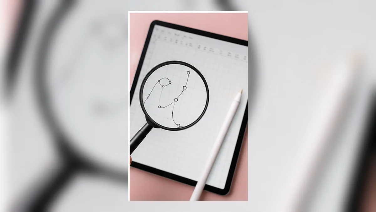
A raster image is a photograph of your design. A vector file is the recipe.
Enlarge a photograph of a cake and you get a blurry photograph. Follow the recipe at twice the size and you get a bigger cake, just as sharp.
Why phone artwork is almost always raster
Most phone design apps — the general-purpose ones, the sticker makers, the text-effect apps — build everything as pixels. There’s a good reason: pixels are simple, fast to draw, and identical on every device.
The cost only shows up at the end. When you export, you get a PNG at whatever size the app chose — often something like 1080 pixels wide, because that’s the size a phone screen wants. Print that at 8 inches and you’re spreading 1080 dots across 8 inches: 135 dots per inch, where print wants roughly 300. Each dot has to cover more than twice the area it was drawn for, and your eye reads that as softness.
You can’t fix it afterwards. Enlarging a raster image invents pixels that were never there. Apps that promise to “upscale” are guessing, and on hard-edged lettering the guess is visible.
When each format is the right answer
Don’t think of vector as “better.” Think of them as different jobs.
Use raster (PNG or JPG) when:
- The design contains a photograph
- You’re posting to social media
- The artwork will be printed and then cut around, and the printer needs full colour, gradients and texture
- You need transparency in a format everything understands (PNG)
Use vector (SVG or PDF) when:
- The design is lettering, shapes, logos, decals
- It will be cut by a machine
- It might be enlarged later — signage, shirts, banners
- You want the file to stay small and stay editable
The rule of thumb that covers most craft work: printed-then-cut artwork wants PNG; vinyl and iron-on want SVG.
”But my PNG has to be big anyway — why not just export huge?”
You can, and for printed-and-cut work you should. Aim for around 300 pixels per inch of finished size: an 8-inch sticker sheet wants roughly 2400 pixels across.
But a big PNG doesn’t make the artwork vector. Two things still bite:
- If the design started small, exporting big doesn’t add detail. Enlarging a 1080-pixel design to 2400 pixels gives you a 2400-pixel blurry image.
- It still can’t be cut directly. A cutting machine needs edges, and it has to trace a raster image to find them. Tracing is approximate, and on lettering it rounds corners and wobbles curves.
So export big and start from artwork that was built as shapes in the first place.
How to tell what you’re holding
- Look at the file extension.
.svgand.pdfare usually vector..png,.jpg,.heic,.webpare always raster. - Zoom in hard. Open the file and zoom to 800%. Vector edges stay crisp; raster edges turn into visible squares.
- Check the file size. A full-page vector of lettering is often under 100 KB. A print-resolution raster of the same design is several megabytes.
- Careful: a PDF can contain a raster image. If someone exports a photo to PDF, it’s still a photo. PDF is a container, not a guarantee.
Building artwork that survives being enlarged
If you want one file that works at any size, the design has to be generated as shapes, not drawn as pixels. That means:
- Text stays as outlines, not as a rendered picture of text
- Outlines and borders are real shapes with an inside and an outside, not strokes with a thickness setting
- Effects that must scale — layered borders, 3D depth, patterns — are built from shapes too, not baked into a bitmap
Some effects genuinely can’t be vector. Soft shadows and photographic textures are made of gradients that only pixels can express; those get rendered as images even in a vector file, and that’s normal. What matters is that the letters and the cut edges stay as shapes.
This is exactly why decorated lettering built for print holds up at large sizes — see Free Print-Quality Decorated Text Maker.
The other half of the problem: colour
Sharpness isn’t the only thing that changes between screen and paper. Screens make colour by mixing light; printers make it by mixing ink. The vivid cyan and neon pink that glow on your phone have no ink equivalent, so they arrive on paper noticeably duller.
Nothing is broken — it’s a physical limit. But it’s worth knowing before you commit to a colour scheme, because “the print looks dull” is often a colour problem being blamed on resolution.
For the full explanation, see What is CMYK?
Every file type you’ll actually meet
| Extension | Kind | Good for | Watch out for |
|---|---|---|---|
| SVG | Vector | Cutting, lettering, logos | Strokes don’t cut; needs a stated size |
| Either | Print submission, sharing | Can contain a raster image — check before trusting it | |
| EPS / AI | Vector | Received from designers | Older formats; convert to SVG for cutting |
| PNG | Raster | Printing, transparency, web | No physical size; grows large at print resolution |
| JPG | Raster | Photographs | No transparency; compression artefacts on hard edges |
| HEIC | Raster | iPhone photos | Many tools won’t open it — convert to PNG or JPG |
| WEBP | Raster | Web images | Same — convert before using in a design tool |
| DXF | Vector | Some cutting workflows | Carries shapes but usually not colour |
The practical takeaway: the only formats that cut are SVG and DXF, and the only ones you should print from are PNG, JPG and PDF. Everything else is a conversion step waiting to happen.
Tracing: when it’s acceptable, and how to do it least badly
Sometimes you only have a raster image — a logo someone sent, a scan of hand lettering, an old design whose source is gone. Tracing converts it to shapes so it can be cut. The result is never as good as building it as vector from the start, but it can be good enough.
When tracing is reasonable:
- The artwork is flat colour with hard edges — a logo, a silhouette, bold lettering
- The source image is large and clean — at least 1000 pixels across the artwork itself
- You’re prepared to clean up the result
When tracing will disappoint:
- Photographs, gradients, soft shadows
- Small or compressed images (screenshots, social media downloads)
- Fine detail — hair, thin script, texture
Getting the best trace:
- Start with the largest version you have. Not the version you posted online.
- Increase contrast before tracing. A crisp black-and-white source traces far better than a grey one.
- Remove the background first if the tool lets you, rather than relying on the trace to separate it.
- Trace, then simplify. Most traces produce far more points than needed; reducing them smooths wobbles.
- Zoom to 400% and inspect the corners. Tracing rounds sharp corners — that’s usually where it looks wrong.
The one thing tracing can never do: recover detail that isn’t in the pixels. If the source is blurry, the trace follows the blur.
DPI, PPI and the number that actually matters
These get used interchangeably and it causes real confusion.
- PPI (pixels per inch) — a property of your file. This is the one you control at export.
- DPI (dots per inch) — a property of the printer. A 1200 dpi printer lays down more, smaller ink dots to reproduce your pixels.
You cannot fix a low-PPI file with a high-DPI printer. The printer will reproduce your soft image very precisely.
The number to remember is 300 PPI at finished size. Everything else follows:
| Finished size | Pixels needed |
|---|---|
| 2 in | 600 |
| 4 in | 1200 |
| 8.5 in (letter width) | 2550 |
| 12 in | 3600 |
A common trap: an image described as “300 dpi” is meaningless without a size. A 600 × 600 image “at 300 dpi” is a 2-inch image. Print it at 6 inches and it’s 100 ppi.
An export checklist by project type
Vinyl decal (cut only) SVG · filled shapes, no strokes · letters merged · width set in inches · one colour per layer
Printed sticker (print, then cut) PNG at 300 ppi of finished size · bleed past the cut line · cut path separate · colours checked for neon shift
Heat-transfer design SVG · mirrored · merged · width in inches · minimum stroke checked against the material
Large print (poster, sign, banner) Vector wherever possible (PDF or SVG) · if raster, 150–300 ppi at final size · remember viewing distance allows lower resolution on very large pieces
Social media PNG or JPG at the platform’s recommended pixel size · no bleed needed · don’t bother with vector
Print this list once and most format questions stop needing to be asked.
Frequently asked questions
Q. Can I convert a PNG to an SVG and get sharpness back?
No. Tracing a PNG produces vector shapes that follow the blurry edges — you get a sharp file of a blurry design. Trace only when you have no alternative, and expect to clean it up.
Q. What resolution should I export at?
For printing, about 300 pixels per inch of finished size. For screens, whatever the platform asks for. When in doubt, export larger than you need — you can always scale down, never up.
Q. Is SVG always better for a cutting machine?
For cutting, yes: the machine follows the shape edges directly instead of guessing them from pixels. For a design that gets printed first, you still need a raster image for the printed part.
Q. My SVG opened but nothing was there.
The artwork was probably made of strokes rather than filled shapes, or it had no physical size and landed at essentially zero. Both are export settings, not damage.
Q. Why is my PDF blurry when PDF is supposed to be vector?
Because a PDF can contain a raster image. If the design was rendered to pixels before being placed in the PDF, the PDF just carries the pixels.
Summary
- Raster stores dots; vector stores instructions — that’s the whole difference
- Phone apps mostly produce raster, so enlarging is where designs fall apart
- PNG for printing, SVG for cutting covers most craft work
- Exporting big helps, but it can’t add detail that was never there
- Colour shifts between screen and paper are a separate problem worth knowing about
Once you know which kind of file you need before you start, the blurry-print problem simply stops happening.
→ Build lettering as vector shapes in your browser (no sign-up · export free for a limited time)
Cricut, Design Space and Silhouette are trademarks of their respective owners. DecoTecoPop is an independent tool and is not affiliated with, endorsed by, or sponsored by any cutting-machine manufacturer.