The short answer
Pick a retro style, type your words, then tweak the colours. Retro lettering is mostly layers — an outline, a second outline, a shadow, a texture — and the Retro Text Generator already has those layers built in, so they rebuild themselves around whatever you type. Download a transparent PNG, an SVG, or a print PDF. Free, no sign-up.
What “retro” actually looks like, by era
“Retro” covers several different looks. Knowing which one you want saves a lot of fiddling.
1950s–60s: diners, polka dots and stripes
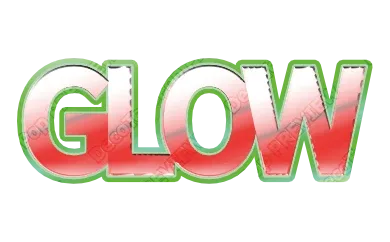
Rounded, friendly letters with a pattern inside — polka dots or candy stripes — framed by a cream or metallic trim. Think ice-cream parlours and diner menus.
1970s: stacked outlines and warm colours
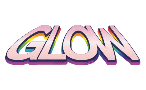
The signature 70s look is two or three outlines stacked around the letters in warm, earthy colours — mustard, burnt orange, brown, cream — often on slightly slanted, chunky letters.
1980s: chrome, neon colours and grids
Mirror-like chrome letters, hot pink and cyan, sharp highlights. This is the look of arcade cabinets, action movie posters and synthwave covers.
Marquee signs (any era)
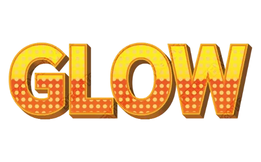
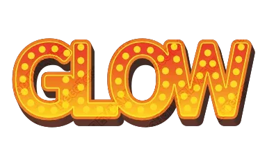
Rows of light bulbs inside the letters, like a theatre or carnival sign. Works for events, cinemas, carnivals and anything “showtime”.
Worn and textured
Rough edges, grain and wood. This is the screen-printed T-shirt or old shop-sign feeling: distressed, handmade, lived-in.
Step by step
- Type your words. Short, bold words work best — a café name, an event, a band.
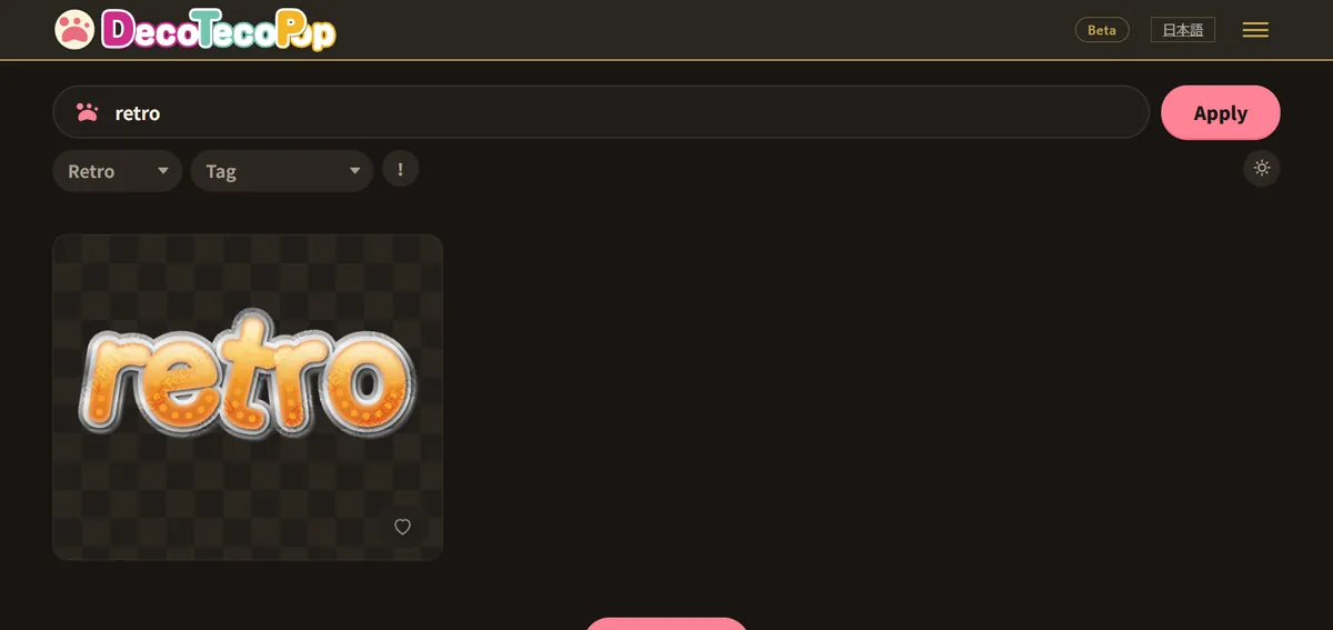
- Pick a retro style. Every style card shows your words, so you can compare eras side by side.
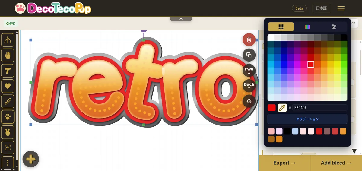
- Change the colours. Open the style and change the fill, each outline and the pattern colours. The structure (outlines, bulbs, texture) stays.
- Download. Transparent PNG for posts and videos, SVG for resizing and cutting machines, print PDF for signs, menus and shirts.
Palettes that read as vintage
| Era | Try these colours |
|---|---|
| 50s–60s | Cherry red, mint, cream, baby blue |
| 70s | Mustard, burnt orange, chocolate brown, cream, teal |
| 80s | Hot pink, cyan, purple, chrome silver |
| Marquee | Warm yellow bulbs on red or deep purple |
| Worn | Faded red, navy, off-white |
A quick rule: retro colours are slightly off. Pure, bright primary colours look modern. Pull them a little towards warm (yellow-ish) or dusty (grey-ish) and they instantly look older.
Tips for a convincing retro look
- Fewer, thicker outlines beat many thin ones. They survive printing and small sizes.
- Texture last, and subtle. Too much grain makes the letters hard to read.
- A slight slant gives 70s energy without bending the letters out of shape.
- One retro word, the rest plain. A retro headline next to a simple body font looks designed; retro everything looks like a costume.
Arcade and game titles
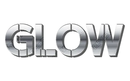
Retro lettering is also the classic look for game titles — chrome and gold bevels, flame gradients, thick dark outlines. If you are making a title for a game, a channel or a stream, these rules matter most:
- It has to read at thumbnail size. Shrink the PNG to the size of a video thumbnail before you commit.
- One strong outline separates the title from busy game art.
- Contrast the fill and the outline — light metal on a dark outline, or the reverse.
There are more title styles in the Game Logo Text Generator. Note that these are still images: animated (blinking or moving) titles are not something this tool makes.
FAQ
Can I use it for a printed sign or menu? Yes. Download the print PDF; it is set up in print colours (CMYK) with bleed and crop marks, which print shops usually ask for.
Can I cut retro text on a Cricut or Silhouette? Yes, with a cut file that puts each colour on its own layer. Gradients, gloss and texture become flat colours when cut, so for the full look, print it and cut around it.
Can I change the words later? Yes — open the downloaded file in the tool again.
Try it in the Retro Text Generator, or see every style in the Logo Text Maker.