The short answer
Type your words, pick a gold or chrome style, adjust the colours if you like, and download:
- a transparent PNG for social posts, videos and slides,
- an SVG for logos that need to stay sharp at any size,
- a print PDF (CMYK, bleed and crop marks) for invitations, menus, cards and signs.
Free, no sign-up, on a phone or a computer — start in the Logo Text Maker.
Kinds of metallic text
Gold
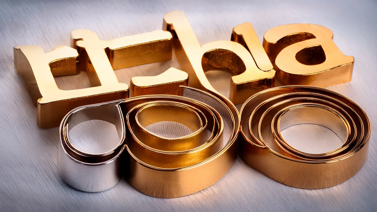
- Champagne gold — soft, pale gold. Weddings, beauty brands, anniversaries.
- Amber gold — deep, warm gold with glitter. Awards, celebrations, premium labels.
- Gold with a coloured outline — playful, sticker-like. Party signs and kids’ events.
- Thin gold serif — elegant, minimal. Invitations and logos for cafés or salons.
Chrome and silver
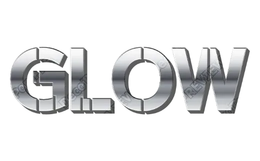
- Silver chrome — mirror-like with sharp highlights. Racing, tech, 80s and Y2K looks.
- Coloured chrome — chrome with a tint (green, aqua). Futuristic, game-like.
- Worn silver — scratched and grainy metal for rock, horror and grunge titles.
Step by step
- Type the words. A name, a date, a brand, a title.
- Pick a metallic style. Every card shows your own words, so you can compare golds and chromes side by side.
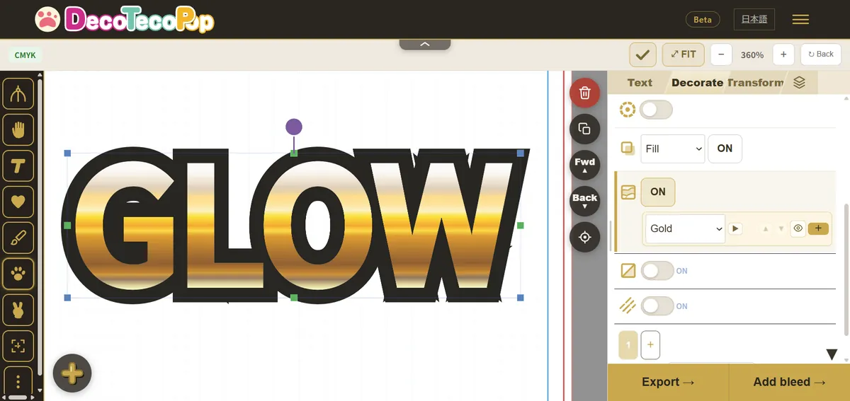
- Adjust. Change the outline colour, the size or the spacing. For gold on a dark background, a thin dark outline keeps the edges crisp.
- Download a transparent PNG, an SVG or the print PDF.
What makes metal look like metal
Metallic text is an illusion built from contrast. A real gold surface reflects its surroundings, so it has very bright highlights and fairly dark areas side by side. Flat yellow never looks like gold.
- Keep the dark bands. Gold needs brown and deep amber next to its highlights.
- Use a dark or rich background. Black, navy, deep green or burgundy make gold glow. On white, add a thin dark outline.
- Don’t over-shine small text. At small sizes, strong reflections break up the letters; choose a calmer gold.
Printing gold and chrome: what to expect
This is the part most guides skip. Ordinary printing cannot reproduce real metallic shine. Printers use four inks (cyan, magenta, yellow and black, called CMYK), and none of them is reflective. A gold design prints as gold-coloured tones — yellows, ambers and browns with lighter highlights — which looks convincing but will not catch the light like foil.
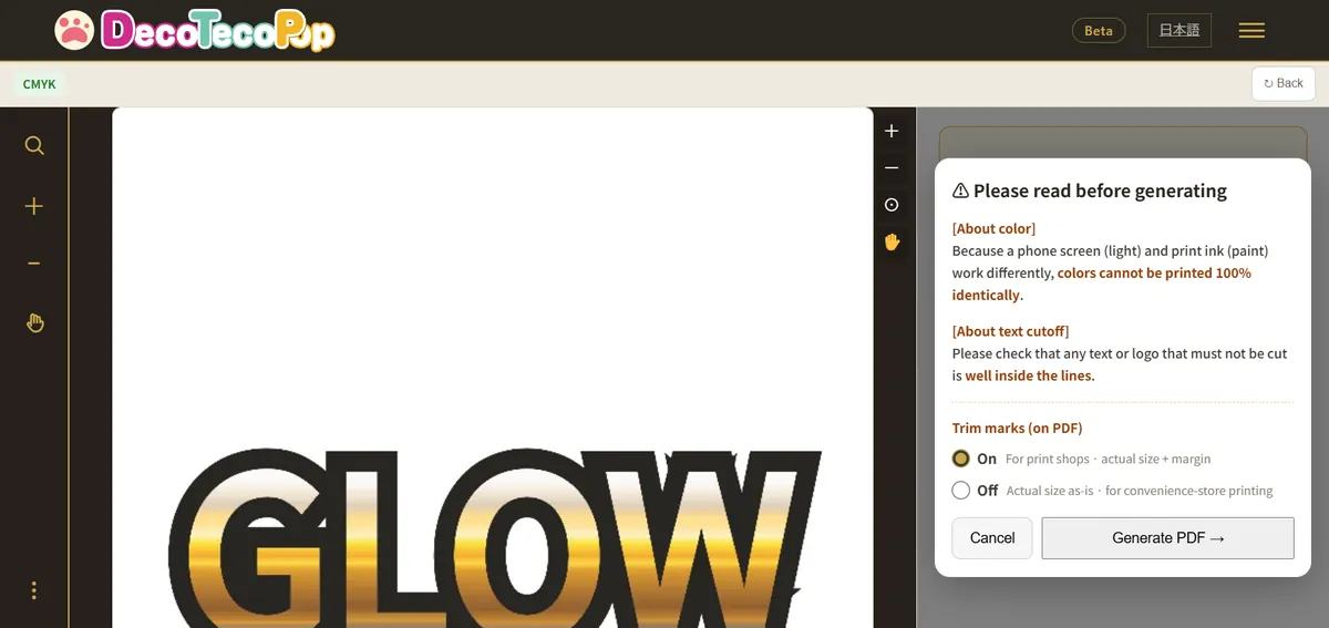
If you need real shine, print shops offer foil stamping or metallic inks as a special option. That needs a separate file prepared with the print shop. The PDF from this tool is a standard CMYK print file, which is what most invitations, flyers and stickers use.
The print PDF does three things for you:
- converts the colours to CMYK, so the preview shows how the gold will actually look in print,
- adds bleed (extra background past the edge, so trimming never leaves a white line),
- adds crop marks (where the paper will be cut).
Where metallic text works
- Wedding and party invitations — names and dates in champagne gold.
- Logos for salons, cafés and boutiques — a thin gold wordmark.
- Award certificates and gift labels — amber gold with glitter.
- Game, video and stream titles — chrome and worn silver.
FAQ
Is it free? Yes, while the tool is in beta, with no sign-up and no watermark.
Is the gold a picture or a vector? The letters and outlines are vector paths in the SVG and PDF. Some glossy and glitter textures are placed inside the file as images.
Can I change the words later? Yes. Open the downloaded file in the tool again.
Try gold and chrome in the Logo Text Maker, or see more title styles in the Game Logo Text Generator.