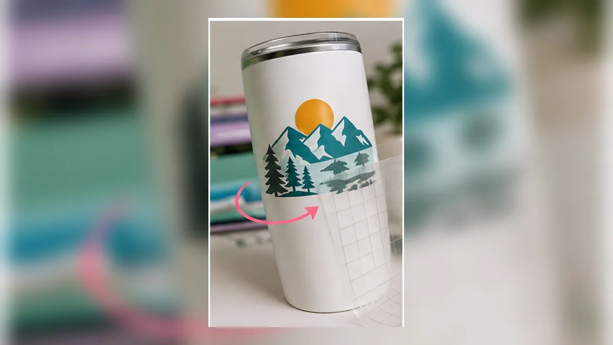
Why straight text refuses to sit flat
Wrap a rectangle of paper around a cylinder and it lies flat. Wrap the same rectangle around a cone and it buckles — the top edge is too short for the wider end. Almost every tumbler people decorate is a cone: slightly wider at the top than the bottom.
That taper is small, which is why it catches people out. The vinyl seems to go on fine, and then the middle of a long word lifts, or the ends creep upward, or you get a wrinkle you can’t smooth out.
The fix is to cut the decal as a curved shape that matches the cone, so it lies flat when it wraps.
The idea in one picture
Unroll the surface of a tapered tumbler and you don’t get a rectangle. You get a ring segment — a piece of an annulus, curved along the top and bottom, with the sides angling in.
So your decal should be curved the same way. Text along that curve sits level all the way round; straight text has to stretch or compress to fit, and vinyl does neither.
Working out your arc
You don’t need trigonometry, but you do need three measurements from your actual tumbler. Sizes vary between brands even at the same nominal ounce rating, so measure rather than trusting a chart — including this one.
- Top circumference — a tape measure around the top of the decal area
- Bottom circumference — around the bottom of the decal area
- Height of the decal area
If the two circumferences are the same, you have a cylinder — no curve needed, just wrap it straight. The bigger the difference, the stronger the curve.
The practical shortcut: the ratio between the two circumferences tells you how much curve you need. A difference of under about 3% is usually forgivable on a short word. Anything more and a long phrase will fight you.
Rough starting points
| Tumbler | Typical decal height | Typical taper | Curve needed |
|---|---|---|---|
| 20 oz skinny | 4–5 in | Noticeable | Yes, clearly |
| 30 oz | 4–5 in | Moderate | Yes |
| 40 oz | 5–6 in | Moderate | Yes |
| Straight-wall can cooler | 4 in | None | No — cylinder |
| Wine tumbler | 3 in | Slight | Only for wide designs |
Treat these as starting points, not specifications. Two 30 oz tumblers from different brands can taper differently.
The paper test (do this once, save it forever)
The most reliable method costs one sheet of paper and five minutes.
- Wrap paper around the tumbler over the area you want to decorate.
- Tape it, then trace the top and bottom edges with a pencil.
- Cut along those lines, take it off, and lay it flat.
- You now have the exact unrolled shape — including the exact curve.
- Photograph or scan it, or measure the arc directly.
Keep this template. Every future design for that tumbler starts from the same shape, and you never guess again.
Sizing the design inside the arc
Two mistakes account for most wasted vinyl:
Filling the whole circumference. A decal that goes all the way round has to meet itself perfectly. Leave a gap — using about 70–80% of the circumference gives you room to position without a visible seam.
Ignoring the handle. If the tumbler has one, the usable area is much narrower than the circumference suggests.
Also remember that people hold tumblers. Keep lettering above the grip zone — roughly the bottom third — or it wears off.
Curving the letters themselves
Once you have the arc, the text has to follow it. There are three different things software can do, and they’re not the same:
Rotate each letter. Every letter is turned to sit perpendicular to the arc. This is the classic curved-text look and is right for most tumbler work.
Keep letters upright. Letters follow the arc’s path but stay vertical. Good for gentle curves and wide words; looks wrong on a tight arc.
Distort the outlines. The letterforms themselves are bent, so the tops of letters are wider than the bottoms. This is what genuinely matches a cone, and it’s the option most machine software doesn’t offer.
For most tumbler decals the first option is fine, because the arc is gentle. For anything approaching a strong taper, distortion is what makes the difference between “curved text” and “text that fits.”
On what cut-machine software can and can’t do with text, see Design Space Text Limitations.
The order of operations that saves the most vinyl
Do these in the wrong order and you’ll redo the design.
- Measure the tumbler (or pull out your paper template)
- Type the text and choose the font
- Apply the curve — before anything else
- Add outlines and layers — so they follow the curve too
- Set the physical size in inches
- Export
The common failure is applying the curve last: outlines and layers added beforehand stay straight while the letters bend, and everything falls out of alignment.
Materials and application notes
- Heat-transfer vinyl on a tumbler needs a heat source that follows a curve — a tumbler press or a heat-shrink wrap. A flat press will only touch a stripe.
- Adhesive vinyl is far more forgiving on curves, which is why most tumbler decals use it.
- Apply from the centre outward. Position the middle of the design first, then smooth toward each edge. Starting at one end guarantees the other end lands wrong.
- Warm the vinyl slightly on a strong curve — it becomes more willing to conform.
- Split a very long phrase into two lines. Two shorter arcs behave far better than one long one.
The geometry, for people who want the number
You can do this entirely with the paper template. But if you’d rather calculate it, the maths is short.
A tapered tumbler is a slice of a cone. Unrolled, it becomes part of a ring. What you need is the radius of that ring’s inner edge — call it r — and then the arc follows.
With:
- C₁ = circumference at the bottom of the decal area
- C₂ = circumference at the top
- h = height of the decal area
Then:
r = h × C₁ / (C₂ − C₁)
That r is the radius of the arc your bottom edge should follow. The top edge follows a second arc of radius r + h.
A worked example. A tumbler measuring 9.0 in around the bottom of the decal area, 9.6 in around the top, over a 4 in height:
r = 4 × 9.0 / (9.6 − 9.0) = 36 / 0.6 = 60 in
A 60-inch radius is a very gentle curve — which is exactly why the taper is easy to underestimate and still causes wrinkles. Over a 9-inch width, a 60-inch-radius arc rises about 0.17 in in the middle. Small, and quite enough to buckle vinyl if you ignore it.
Sanity check: if C₂ − C₁ is near zero, r becomes enormous — a straight line, which is correct for a cylinder.
Placing the design: heights that look right
Getting the arc right and then centring it badly is a common way to waste a good file.
- Vertical centre of the decal area, not of the tumbler. Lids and bases eat the top and bottom.
- Leave the bottom third clear — that’s the grip zone, and decals there wear first.
- Avoid the seam if the tumbler has one, and avoid straddling a change in diameter.
- For a 20 oz skinny, a decal roughly 3.5–4 in tall centred slightly above the middle usually looks balanced.
- For a wider 30 or 40 oz, you have room for two lines — but two shorter arcs behave better than one tall one.
Applying a curved decal step by step
- Clean the surface with isopropyl alcohol and let it dry fully. Skipping this is the most common cause of edges lifting later.
- Find the centre. Mark it with a small piece of tape at the top and bottom of where the design will sit.
- Cut the transfer tape generously — larger than the design, so you have something to hold.
- Hinge it. Tape the transfer sheet along the top edge only, so you can lift it, position, and lower it again.
- Anchor the middle first. Press the centre of the design down, then work outward toward each edge with a squeegee or a card.
- Follow the curve with your pressure, not against it. Push along the arc, not across it.
- Burnish firmly, then leave it for a few minutes before removing the transfer tape.
- Peel the tape back at a sharp angle, slowly. If any vinyl lifts, lay the tape back down and burnish that area again.
- Wait 24–72 hours before washing. Adhesive continues to bond after application.
If a wrinkle appears mid-application: lift back to just before the wrinkle and re-lay. Trying to push a wrinkle flat spreads it.
Troubleshooting
| Symptom | Cause | Fix |
|---|---|---|
| Middle bubbles, ends sit flat | Arc too strong for the taper | Reduce the curve; re-measure |
| Ends lift, middle sits flat | Arc too shallow, or straight text on a taper | Increase the curve |
| Wrinkles across the whole design | Design too tall for a tapered area | Split into two lines, or reduce height |
| Design won’t meet itself around the cup | Using too much of the circumference | Target 70–80% |
| Letters look tilted | Curve applied with the wrong rotation mode | Switch between “rotate each letter” and “keep upright” |
| Edges peel after a few days | Surface not cleaned, or washed too soon | Clean with alcohol; wait 24–72 h before washing |
| Outline is straight but letters are curved | Curve applied after the outline | Curve first, then add outlines |
Making a size chart you can actually trust
Since brands differ, build your own once:
- Every time you use a new blank, make the paper template and write on it: brand, capacity, decal-area height, top and bottom circumference.
- Photograph it flat next to a ruler.
- Keep them in one folder named by brand and size.
After five or six blanks you have a chart that’s correct for your stock, which no general table can be. It also tells you instantly whether a new blank matches one you already have a design for.
Frequently asked questions
Q. Do I need to curve text for a straight-sided cup?
No. If the top and bottom circumferences match, a rectangle wraps perfectly. Save the curve for tapered tumblers.
Q. How do I know how strong the curve should be?
Use the paper template. It gives the exact arc for that tumbler, which is more reliable than any chart — including the one above.
Q. My curved text looks fine flat but wrong on the tumbler.
Usually the curve was applied to the letters but not to the outlines or layers around them. Apply the curve first, then add everything else.
Q. Why did the ends of my decal lift?
Either the arc was too shallow for the taper, or the design used too much of the circumference and had nowhere to go. Try 70–80% coverage.
Q. Can I reuse a template between tumbler brands?
Not reliably. Nominal capacity doesn’t determine taper — measure each new blank once and keep the template.
Summary
- Tapered tumblers are cones, and a cone unrolls to a curved ring segment, not a rectangle
- Measure top circumference, bottom circumference, height — or make a paper template once
- Use 70–80% of the circumference and stay above the grip zone
- Apply the curve first, then outlines and layers, then set the size in inches
- Charts are starting points; brands differ at the same ounce rating
Get the arc right once and every tumbler after it is a template away.
→ Curve lettering and export at real size (no sign-up · export free for a limited time)
Cricut, Design Space and Silhouette are trademarks of their respective owners. DecoTecoPop is an independent tool and is not affiliated with, endorsed by, or sponsored by any cutting-machine manufacturer.